Showing posts with label graphic design. Show all posts

Wednesday, April 03, 2024

,
cottagecore inspired brand kits | on the creek blog // www.onthecreekblog.com

 Hey there, Besties! 🌟✨


Today, I'm diving deep into a topic that's not just close to my heart but practically a piece of it - graphic design. Oh, how this journey began! Picture a seventh grader, wide-eyed and filled with dreams, dabbling in website design. That was me, and let's just say the passion hasn't dimmed even a little. It's been a whirlwind of colors, fonts, and layouts ever since, and guess what? I'm absolutely living for it. 🎨💻


Now, after years of mixing, matching, and sometimes mismatching (we've all been there, right?), I feel like I've hit the sweet spot with my blog's colors and fonts. It's like finding the perfect recipe that makes your soul sing. And because sharing is caring, I'm beyond thrilled to pull back the curtain on my brand kits. 💌✨


But hold on, let's chat for a sec. What's a brand kit, you ask? Imagine it as your design fairy godmother. It's a magical toolbox that holds all your brand's visual elements - colors, fonts, logos, and more. It's what keeps your style consistent, recognizable, and oh-so-you. Whether you're sprucing up your blog or sending out emails, your brand kit ensures everything screams 'you' at first glance. 🧚‍♀️🛠️


So, without further ado, let's wander through the whimsical world of cottagecore-inspired brand kits I've lovingly crafted in Canva. If you're all about that rustic charm, soft pastels, and a touch of nostalgia that feels like a warm hug, you're in for a treat!


cottagecore inspired brand kits | on the creek blog // www.onthecreekblog.com

The Dreamy Meadow Kit

Imagine your brand frolicking in a meadow at dawn, the first light kissing the dew. It's a palette of tranquil creams, sage greens, and soft earth tones, paired with fonts that sing songs of the earth – think Chloe and Moontime, each letter crafted with a touch of whimsy.


cottagecore inspired brand kits | on the creek blog // www.onthecreekblog.com

The Rustic Homestead Kit

Next, we step into the warmth of an old-time kitchen, with hues that tell tales of sunsets on the farm and rich soil between fingers. Fonts like Abril Fatface and Montserrat stand like timeless wood beams, solid and welcoming, a foundation for stories yet to unfold.

cottagecore inspired brand kits | on the creek blog // www.onthecreekblog.com

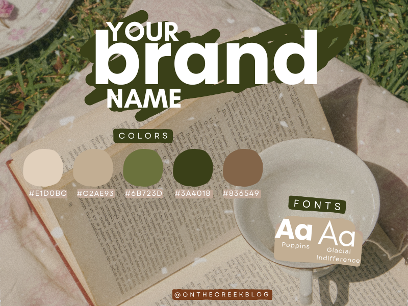
The Vintage Garden Kit

Delicate and with the grace of bygone eras, this kit evokes the spirit of a Victorian garden in full bloom. The colors: blush pinks, mossy greens, and a whisper of aged parchment. And the fonts? Poppins and Glacial Indifference, each a nod to the juxtaposition of modern clarity and historical allure.


cottagecore inspired brand kits | on the creek blog // www.onthecreekblog.com

The Enchanted Cottage Kit

Lastly, for the souls who see magic in the stars and hear whispers in the wind, this kit is for you. It's an elixir of dusky mochas, creamy ivories, and the richest of terra-cotta, all coming together like a spell. The fonts, Black Mango and Quicksand, are the final enchantment, casting your brand's story in the most captivating of lights.


Creating these brand kits has been a journey of love, inspiration, and a little bit of magic. And the best part? Canva has made it delightfully easy to bring these visions to life. Whether you're a seasoned designer or just starting to explore the vast universe of graphic design, remember that your brand is your story. And with the right tools, you can tell it in the most beautiful way possible.


Until next time, keep creating, dreaming, and being the amazing you. And remember, in the vast canvas of life, you're the artist. Paint your story bright and bold. 🌈✨

Monday, February 19, 2024

,


Hey there, Besties! 🌟


I'm super excited to share my latest obsessions - seven color palettes that are rocking my world right now! 🎨✨ From the depths of earthy greens to the warmth of sunset hues, these palettes are giving me all the feels, and I just know you're going to adore them as much as I do.

The Enchanted Forest color palette | on the creek blog // www.onthecreekblog.com

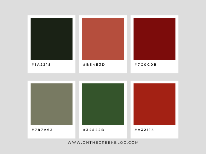
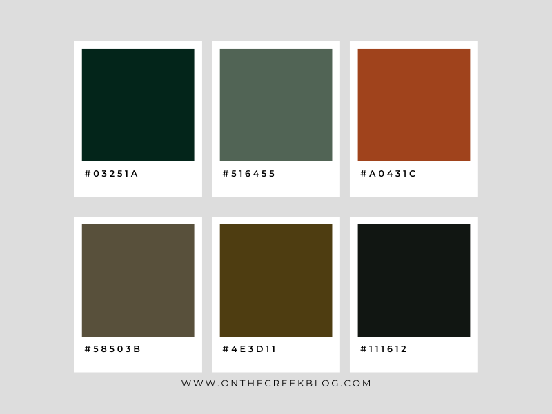
The Enchanted Forest 🌲

Imagine wandering through a mystical forest, with the sun peeking through the canopy. This palette is a dreamy mix of deep emeralds and sage tones, grounded by a rich, dark moss. It's nature's own cozy nook that whispers of secret stories and old-world charm.


Sunset on the Savannah color palette | on the creek blog // www.onthecreekblog.com

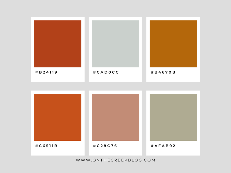
Sunset on the Savannah 🌅

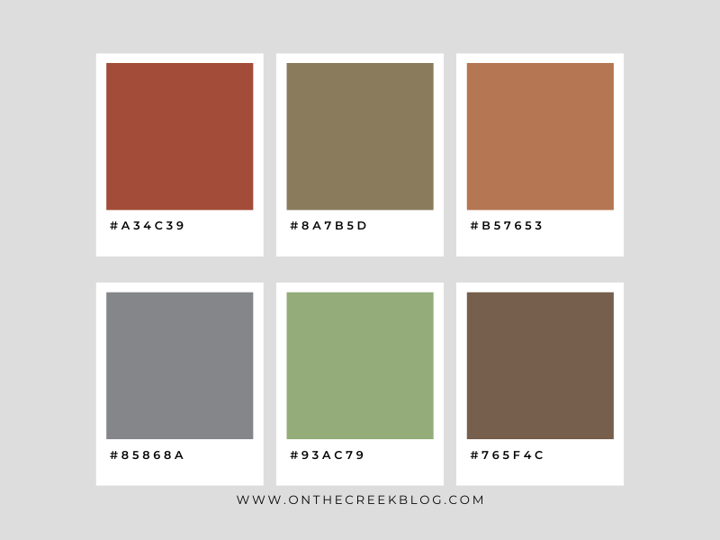
This palette is a safari of color, where dusty terracottas meet the golden hour. It's as if the sun is setting over a sprawling savannah, casting a glow that warms the soul. These hues are perfect for anyone looking to add a touch of adventure to their space or design.

Ocean's Depths color palette | on the creek blog // www.onthecreekblog.com

Ocean's Depths 🌊

Dive into the tranquility of the ocean with this palette. From a teal that embodies the essence of the sea to a mysterious midnight blue, it's a color story that's both serene and profound. It's like the ocean's depth in your very own home, evoking a sense of peace and introspection.

Autumn in New England color palette | on the creek blog // www.onthecreekblog.com
Autumn in New England 🍂

Get ready for a cozy autumn vibe with this palette. With colors reminiscent of fall leaves and pumpkin spice, it's a little bit of that magical New England autumn, no matter where you are. These warm, inviting tones are like a hug for your walls or digital design!

Moroccan Bazaar color palette | on the creek blog // www.onthecreekblog.com


Moroccan Bazaar 🏺

Step into the vibrant energy of a Moroccan market with this palette. With bold, spicy hues that tell tales of exotic places and distant lands, it's an invitation to infuse your life with color and energy. Let's bring the buzz of a bustling bazaar into our homes!

Desert Dusk color palette | on the creek blog // www.onthecreekblog.com

Desert Dusk 🌵

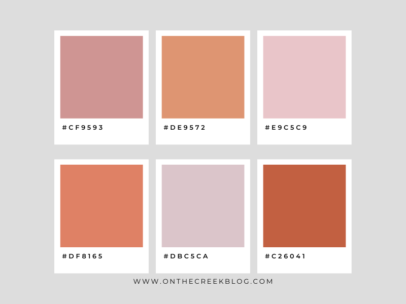
This palette captures the stillness of the desert at dusk. It's a blend of soft pinks and deep, earthy tones that echo the quiet beauty of the wilderness. It's about those moments of solitude and beauty we find in the most unexpected places.


Pastel Daydreams color palette | on the creek blog // www.onthecreekblog.com

Pastel Daydreams ☁️

Last but not least, float away with these whimsical pastels. This palette is a breath of fresh air, a gentle reminder of soft cotton candy skies and the sweet serenity of daydreams. It's perfect for crafting a space or design that's a soft place to land on the busiest of days.


Remember, Besties, these are more than just colors. They're stories, they're emotions, they're the backdrop to our lives. So whether you're painting a room, choosing a throw pillow, or upcycling that thrift store find, let these palettes inspire you to create something beautiful.


Before I sign off, remember to swing by the blog later for an update on my previous color palette post, now with a little twist of my new style. Spoiler alert: It's going to be fab! 🌈✨


Until then, keep shining and DIY-ing!

Monday, July 02, 2018

,

15 Totally Free Fonts

Buttercup  //  Emily The Brush  //  Mayton  //  Salsabilla  //  Contento  //  Better Together  //  Apples Script  //  Bromello  //  Remachine Script  //  Sweet Pea  //  Unrulyness  //  Sunrise International  //  Molleat  //  Ting Tong  //  Meadowbrook

I love finding new fonts.  It had been a while since I downloaded any fonts, so I went on the search for some neat & pretty ones that were free.  I found so many good ones that I just had to share!  I love every one of them.  I’m even using one in my blog logo (Buttercup).

On the Creek blog is proud to be a part of the T&J Maintenance family - turning houses into homes.